What's Inspiring Me

Clever Design Using Stripes

Stripes-Template-Thumnail.jpg

"Only use what is necessary to communicate your story or idea. Subtraction is the path that allows us to create clarity from complexity."  Matthew Luhn

I love the idea of using subtraction to achieve a striking design. Recently I became inspired by the work of several designers who played with stripes to convey an idea. 


01. Designer, Peters Design Co.

Stripes-4.png
 

02. Designer, Malika Favre

Arbor-Collective_Artists_Malika-Favre6.jpg
 

03. Designer, Tyler Spangler

Stripes-3.jpg
 

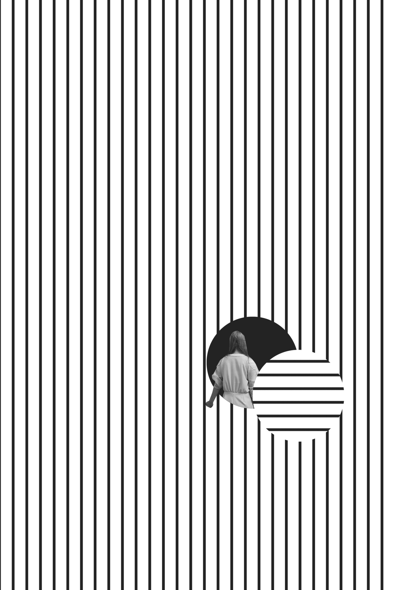
04. Designer, Phil Jones

Stripes-2.jpg
 

Ingenious, no? With slight manipulations of horizontal and vertical stripes all of these artists are expressing a strong point of view.

This week I'm inspired to use simple bold elements to "create clarity from complexity."


Which design is your favorite?

Share with me in the comments!


Lessons on Patient Storytelling from Woodworker Frank Howarth

Frank Howarth is a woodworker, architect and YouTube sensation. In contrast to the sped up 30 second clips that fill our timelines (here’s looking at you Tasty), Frank’s videos are often over 10 minutes long. 

And you know what? I watch until the end of every video.

Master of Pace

Frank Howarth has mastered patient storytelling. His pace is leisurely. His editing is superior.

Frank begins his videos explaining his vision for a new project. He’ll use rough sketches or illustrations to show what he has in mind for the final project. Often he'll go through several sketches before landing on the right design. 

Frank-01.jpg

This is the first step in the brilliance of his storytelling.

Frank doesn’t skip the gray-area and go straight to the answer. When deciding between two designs, he talks through pros and cons of choosing one design over another. If he begins a project one way and then decides to backtrack, he will keep in the footage from the first iteration. 

Frank grants you permission you to sit in his sawdust filled shop and go through his creative process.

And what creative process isn’t messy and non-linear?

I admire how he allows his mistakes to become a part of the learning process for his viewers. His ego doesn't get in the way of sharing what really happened with a project.

Editing to Delight

You’re along for the ride as he selects the wood, sands down the material, glues necessary pieces together and starts the wood carving. Pay attention to the camera angles and variety of shots he includes. I’m constantly delighted at a camera placed inside of a lathe spinner, or a Go-Pro attached to the handle of his dolly.

Frank-02.jpg

Frank deploys a toolbox of video tricks including stop-motion, close angles, wide shots, tracked movement, and some editing trickery. His most famous video is shot completely as stop-motion, but his later work displays a wider variety of talent.

The Use of Narration and Natural Sound

Perhaps most masterful of all is his ability to keep steady pace with the right amount of narration and natural sound. During longer shots Frank talks through how the wood is behaving and the techniques being put to use. 

But Frank doesn’t talk during all of his videos. The clacking of clamps and scraping sounds of the lathe provide a natural rhythm and heartbeat to each video.

Woodworking is an introverted process and his videos showcase the peaceful nature of the craft. I don’t doubt that he spends as much time piecing together even audio as he does choosing clips from hundreds of hours of footage.

Take a look at several of my favorite videos below.


Five Lessons About Video Storytelling from Frank Howarth

  1. Restrain from editing out the messy parts of the creative process.

  2. Use a variety of angles to keep the vantage point unique.

  3. Surprise your viewer with different styles of editing.
     
  4. Let the audience step into your decision making. 
     
  5. Use natural sound for a consistent rhythm. 

Do you have a favorite YouTuber who has a specific style of storytelling?

Share with me in the comments below!


Two Brand Asset Pages That Are So Beautiful I Could Weep

The Type A Marketer in me is a huge nerd for brand asset pages. 

What is a brand asset page? This is a page that outline a company’s logo, color palette and word mark. Brand Asset pages are offered by companies that receive press attention and want to ensure their design elements are portrayed correctly. (Sometimes these can fall into a Media Kit.)


There are several reasons these pages are ingenious:

  1. High resolution logos in MULTIPLE formats guarantees designers are using the most to-date logo without pixilation. This is just plain smart. If you are lucky, your company will be so popular that people will have a reason to use your logo all over the internet. Should you try and stop it? Good luck! Smart companies recognize that a .PNG will get into Google Images one way or another, so they might as well be the gatekeepers for where to get it.
     
  2. Consistent branding is key to sticking in a consumer's brain. There is a reason you recognize Tiffany Blue!
     
  3. You can be the definitive guide on how others should shorten, square and desaturate your logo. Logos are never one-design fits all. When you need a tiny 16 pixels by 16 pixels favicon you can bet your whole logo won’t make it in. What does become the most refined version of the design? Setting guidelines publicly allows your company to have style guide for others to follow. 
     
  4. Even when writing a name there is room for error as more companies adopt nonsensical names. Explain how people should space, capitalize and even pronounce your name if it is particularly unique. MailChimp's name is a perfect example!

But that’s enough explaining. You’re here to see the design ASMR! 

MailChimp’s Brand Assets Page

Go to the page ›

For starters, this page includes this section:

“A curated selection of our brand colors.. Download the entire palette as an ASE file.”

Be still my heart! 

MailChimp’s lovable mascot, Freddie the chimp, has evolved significantly since the earlier years of their company. Their brand page shows the six outdated versions of Freddie along with the most recent design. 

They also offer guidelines on how their logo should be employed based off of the tone of the communication. This is fascinating and something I never stopped to consider! 
 

What should I use?

Freddie is fun, but sometimes our communication is serious. If you’re using branding on a serious message, please use the MailChimp script logo.

You know about MailChimp. Some folks don’t. If you’re talking to an audience that’s unfamiliar with us, where “MailChimp” isn’t written or said, use our script logo.

If the audience you’re speaking to is familiar with with MailChimp, feel free to use Freddie to represent the brand.”
 

Shopify’s Brand Assets Page

Go to the page ›

Color and company identity go hand in hand. Here is a time where “close enough” just doesn’t cut it. Feel free to watch this Parks & Rec video before continuing on. 

Shopify goes so far as to name their two main colors: Shopify Green and Shopify Slate. They include the web color code, RGB, CMYK and Pantone codes so you can achieve the perfect match.

So satisfying! 

Another interesting section is an overview on spacing their logo. To better illustrate their point, they space around the words based on a proportionate size of their glyph.


I’m nodding my head in happiness as I speak. Brand asset pages are a smart idea for any company with a serious online presence. 


//  I Want to Know

Is there a brand asset page you love? Share it in the comments!